


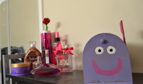


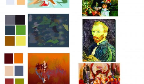
Original Abstract Impressionism...

Color Theory Project. We learned about famous impressionists and then took this project to create original art. The picture says it all. Marisa Faye...
read more
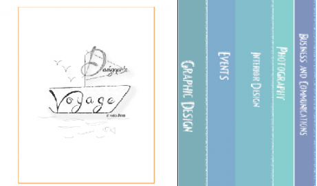
Communicating through the many worlds of design.
Color Theory Project. We learned about famous impressionists and then took this project to create original art. The picture says it all. Marisa Faye...
read more
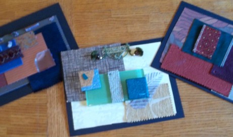
For Color Theory class we had an assignment to play with color and texture then display them in an aesthetically pleasing way. We were to create 3 different boards each of which with a different color Scheme here is what I came up with: This first board I think of a very Chic yet jungle look. A lot of the materials I used for this board I feel would be adorable in a nursery. I used 2 different pieces of wallpaper with unique texture patterns to them, tile samples, a glass sample, cork, wood, fabric, rubber and trim. My color scheme for this board is Analogous- colors next to each other on the color wheel I used 3 colors as my main Hues, Blue, Green and Yellow. For my Next color scheme I did...
read more
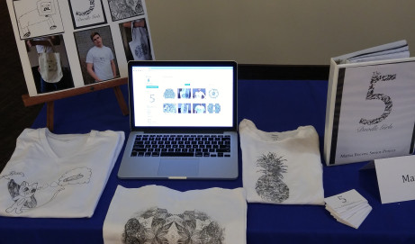
http://www.blurb.com/my/book/detail/3059712#sell-pane For my Presentation 2 class I was assigned to make a “How to” book for Perspective principles we use in Interior Design, I honestly wish someone would have handed me one of these my first semester! I used Adobe Indesign, Photoshop and Blurb.com to complete my book and I have just sent it off to the publishers. Click the link above to view my entire book. -Marisa Faye...
read more
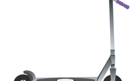
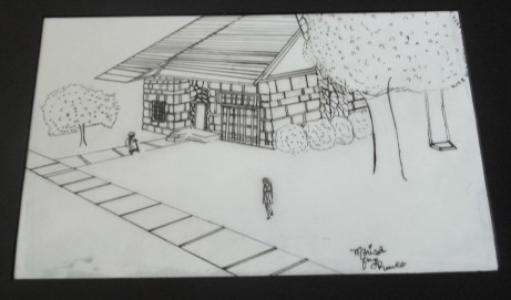
My most recent Project was to design a house based off of a picture and floor plan from a catalog. We were then to build the house in Google sketch up. The next step was to choose the finishes of the house and then plan the landscaping. I added myself to the drawing. To bring my drawing to life I added my very energetic little sister, Addie on her scooter and a swing on the tree. My final Drawing was drawn in pen. So there you have it, my tiny little cozy cottage. -Marisa Faye...
read more
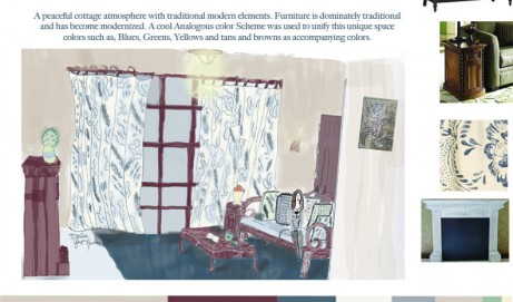
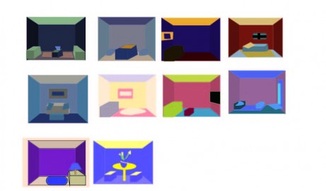
It’s been a while since I’ve made my last post. I am about 1/2 way through my 2nd semester in the Interior Design Program and have kept busy. A recent assignment I had in my color theory class allowed us to experiment with various color schemes: Complementary, Split Complementary, Double Split complementary, Triad and Diad color schemes. We took those color schemes and played with the colors, I designed over 30 rooms. After we had found our color scheme we then took those colors and placed them in our 1 point perspective rooms with full saturation. Then, using those same colors we designed rooms with the same color scheme and designed one adding shade, tint, tone, analogous (adding grey) and the color’s complement to the color scheme. The Challenge we had to face was...
read more
This is my very first drawing of a room such as this. We were assigned to select furniture, people and finishes that would belong in a Gothic Library and then draw them. This takes a lot more time than most would think to draw this. We were given floor plans and were aloud to select the appropriate view we desired for our libraries. Drawn in 2 point perspective using google sketch up, photoshop, illustrator and of course pencils. We were to research the Gothic era to discover what would be fitting for this library. My end product was entitled “Briar Dusk Library” because Briar is a word or rather name that was coined during the Gothic Era and Gothic pieces are typically Goddy and Dark. I thought the word “Dusk” would be a much...
read more
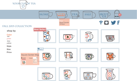
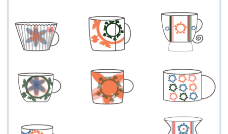
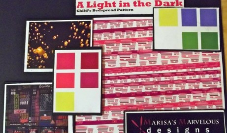
A Light in the Dark Fabric Design: I was assigned to either design an area rug or a fabric. I chose fabric. My sources of inspiration came from: The floating lanterns because I remembered lighting them off at my dear friend Kylie Mae’s Birthday party. (You may recognize these as the lanterns from the popular Disney movie Tangled). Another source of inspiration came from the rhythmic pattern of a simple city scape. As lanterns ascend to the sky they appear to be smaller and smaller as they float away. I created a pattern where the motif that appears to be a lantern starts at a very large size and decreases in size as it works its way up the fabric. Eventually they get big again and the process starts over again. The color palettes...
read more
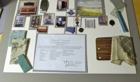
Design Concept: To combine Ms. Pemberly’s love for traditional appeal with her compulsive collection of picture frames in an aesthetically pleasing way. Her walls, bookshelves and nightstand will serve as her picture display. The room will soothe and relax her and take her away from her daily troubles. She will feel comfort and have various spaces to place keepsake items. Assignment: REQUIREMENTS: All samples will be arranged on a board of your choice, size and color. You must use the samples and photo provided for you in the envelope. They willbe a part of your layout. You must use four fabric samples in addition to the one that is provided for you inthe envelope. OBJECTIVES: include the following samples. floor finish trim / molding finish (either painted or wood) wood / paint finish, for...
read more
I chose to use nylon and tight material because, it seems to be an item that women have to buy and instantly become disposable due to runs and rips in them. I figured Nylons and tights would be easy to get ahold of considering how quickly girls go through nylons, I bought a few to add interest and texture to the sphere. I also took advantages of my resources and grabbed about 1/2 a box of Peds from Payless, the lady working there looked at me kinda funny but I smiled and ran out, they are free for the public. I covered the sphere with black nylon until the sphere could not be seen. Then, with the assistance of my roommate I sewed on bunches of nylons and tights in rose shaped bunches. It...
read more
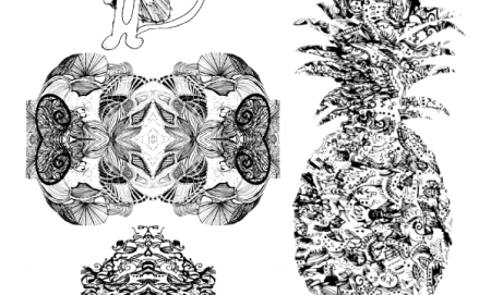
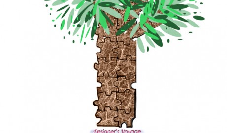
Inspired by my first and last initial and my signature I created the illusion of texture through patterns and motifs. I could see this making a very interesting piece of fabric. – Marisa Faye Reeves ASSIGNMENT # 8:If we use the same shape more than once in a design, we use it in repetition. Repetition is the simplest method in designing. Columns, and windows in architecture, the legs of a piece of furniture, the pattern in fabrics; tiles on the floor are obvious examples of repetition. Unity, one of the principles of design, is the result. 1. Using more than one of the initials from your name, develop a unit shape (single motif). You may distort, rearrange, completely change the initials so that they are completely unrecognizable. The motif can be rounded, squared, or...
read more