Into the Garden

This project was designed to focus on basic photography and photoshop skill sets. We were assigned to take pictures with good composition, appropriate lighting, a sharp focus and strong focal point.
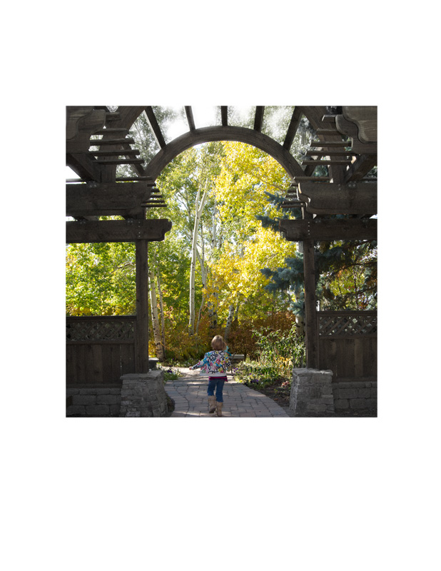
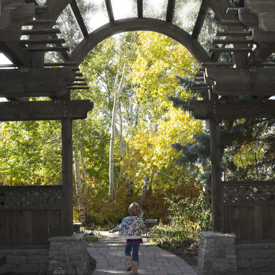
The photoshop portion of this assignment was to desaturate a portion of our photograph and add a filter.
My photograph was shot in garden on campus this last weekend when my sisters came to visit me for the weekend. The little girl in the picture is my baby sister.
After my photo shoot with my sisters I reformatted my image in photoshop, cropped it to the appropriate size and resolution.
After my image was appropriately sized, I reopened the image, created a base layer and then a duplicate layer. On my duplicate layer I preformed a de-saturation technique to the wood in the photo. After I finished the de-saturation I created a another layer to allow a filter on the wood. After my filter was applied on another layer I used my history brush so that I was able to fix the filter and de-saturation that was picked up from my selection tool from the beginning.
Top 3 things learned:
1) Don’t forget to create a duplicate layer first! I can’t tell you how many times I kept forgetting to add my duplicate layer and was not able to perform what I wanted to do.
2) Sometimes It’s so hard to duplicate something you performed in your draft that you really admired- so it takes forever you can either do without or work FOREVER until you get the same effect, I chose the harder of the two. The effect was worth it, I was able to repeat the glow I performed at the top of the image.
3) Old skills resurface- I learned how to layer images and use the history brush to show the original image where the altered portions are not desired.
Programs/Tools Used:
Nikon D3100 Camera
Photoshop
Filter Used:
Defused Glow
6×6 cropped/edited image:
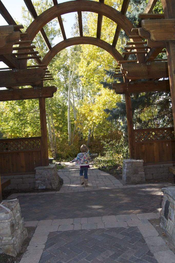
Original unedited/un-cropped image:
I hope you enjoyed this!
-The Designer, The Voyager, Marisa Faye Reeves-


Marisa, I really like the filter you used. I think it adds a nice ambiance to the image. Gives it a nice soft feeling that works well with the subject matter. I also like that you didn’t fully remove the color from the wood and stone when you desaturated the image. The tress also seem a bit sharper which is a good addition to have.
Thank you Blake! I’m super picky about filters and cautious about editing. I think that not removing all the color but just enough to empathize the rest of the picture serves a much stronger purpose! I’m glad you agree!
-Marisa Reeves
I really liked your picture. I thought that you did a great job with making the colors stand out and the picture looks so live and real. I think for the assignment you could have been a little more forward and made the colors stand out or take away some of the color. But, overall I think it looks really good.
Taylor,Thank you! I appreciate your advice. If I took out too much color it makes this image look very fake which is not my objective. This image is life like so I took out just enough to empathize my focus and add a glowing effect to the top of the garden.
Beautiful project! It really helps that you started out with a great photo in the first place and then were gentle on your edits.
Thank you very much! I didn’t want the editing to distract from the subject.
-Marisa Reeves