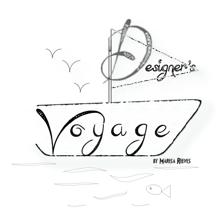
Designer’s Voyage HTML Web Page
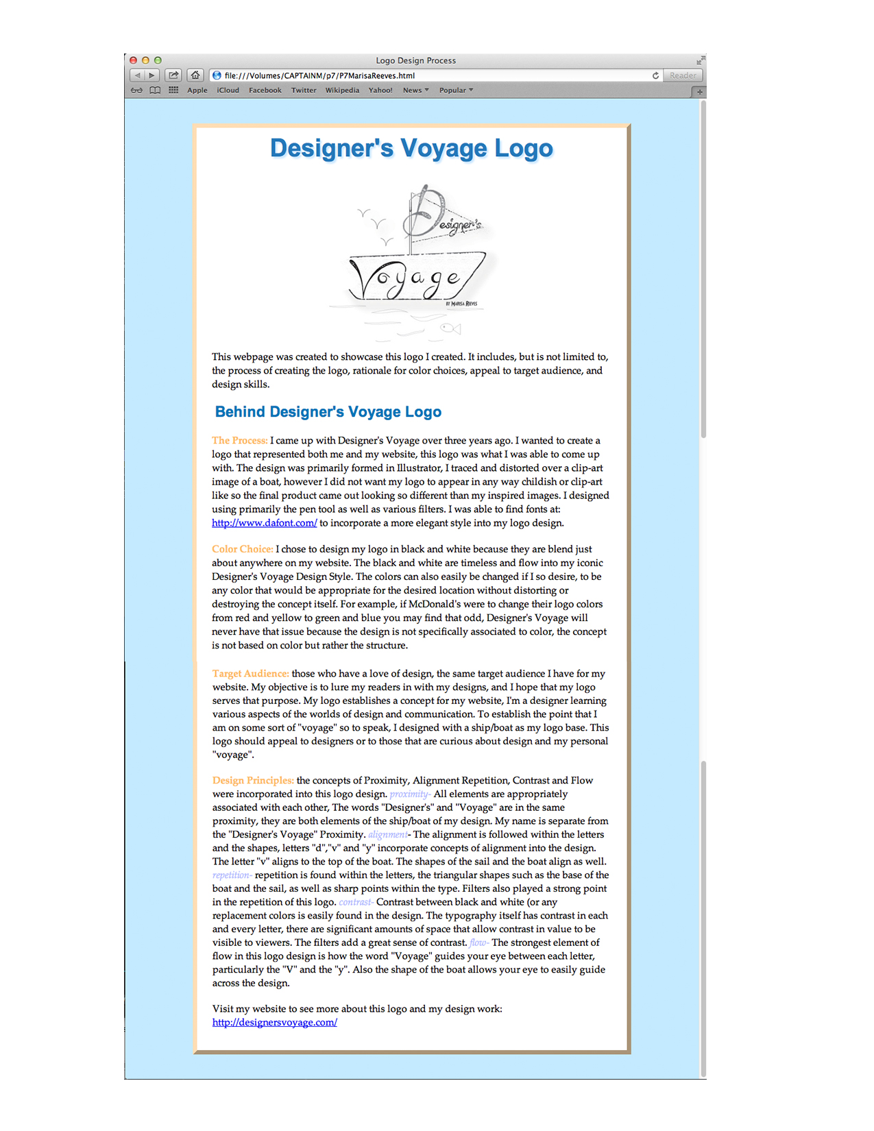
This was my very first experience with HTML. In my visual media class we have been learning the basics of HTML, it’s quite the learning curve for me. Although I’ve grown up on design, this was not something I was ever taught. We were to create a logo, the logo I designed was the one I use as my website logo. After designing a logo we were assigned to form a web-page using HTML. After we received a general understanding of HTML we applied the concept of CSS to our web-page design. The above image is what I was able to form using HTML and CSS.
Top 3 things learned:
1) Basic HTML terminology and layout.
2) W3 Schools helped me a lot. I was able to figure out how to get rid of bullet-points in an unordered list or just change the style as well as applying drop shadows and knowing which properties to apply and where.
3) If something isn’t working, keep looking over your layout. A mistake I made over and over again was not remembering to open my colors with a # sign,the desired colors would not appear on my web-page design without it.
Programs/Tools Used: Illustrator/Photoshop for Logo. TextWrangler for CSS and HTML. W3 Schools as an aid as well as my teachers, classmates and tutors. This was a confusing topic for me.
Font Family #1 (all names) & Category:”Palatino Linotype”, “Book Antiqua”, Palatino, serif; (slab serif)
Font Family #2 (all names) & Category:Arial, Helvetica, sans-serif
Hex Colors:
#c5eaff
#fdddb6
#FFF
#2e79b8
#0576b6
#fbba6b
#b4bbff
Changes made to the CSS: All colors were changed from the original document. The original document had a box with the first header in it, I got rid of that. I changed the location of where the logo was. I changed the Margins of header two and the padding on header one.
Word Count: 614 words were used within my webpage out of a 200 word requirement.
Skills: within the design of the document I used repetition in colors. I also created this webpage to kinda match the style of my real website. The majority of my web-page was designed in left alignment within the center space. The first header and logo used center alignment. The page was written so material was placed under an appropriate topic.
This was quite a challenge for me so I hope you all enjoy this! I now have a clearer understanding and appreciation for web-page design, CSS and HTML.
-The Designer, The Voyager, Marisa Faye Reeves-

Related Posts
-
 Senior Showcase Advertisements
Posted on Apr 14, 2014
-
Photo-book take 2
Posted on Mar 13, 2014
-
 Photo Book Take 1
Posted on Mar 6, 2014
-
 A Brochure about ME!
Posted on Dec 7, 2013
Tags
Share This


