Aphrodite Nail Salon-Logo Design

These Logos were designed for two of my very best childhood friends, they both have their Nail Tech licenses and have shown interest in starting their own business. When I was assigned this project in my Visual Media Class, I instantly thought of the two of them! I volunteered to design a logo for them, free of cost because they have always been such good friends to me, and also I have gotten my nails done by one of my friends a few times for a considerably lower price then if I were to go to a local salon, and she did a good job
After I received the idea of designing for my friends, I asked their permission and then I searched for inspiration. Pinterest and Google Images were my main sources for seeking inspiration. My favorite idea was to use the shape of a nail as a key element in the logo, I used that as my starting point. I opened Illustrator and just started playing with shapes, text and designed my heart away!
Top 3 things learned:
1) This is kinda ridiculous but, even while I was in the Interior Design Program I would accidentally set up a perspective grid and could never figure out how to get rid of it, so I ended up starting projects over again, or just struggle to design certain elements.
2) another ridiculous but useful thing I learned was about the pen tool, I have been using the pen tool for over ten years now and I just now learned from a video how to end the shape without closing it. You just press “P”. This makes life so much easier.
3) I was refreshed on how to un-group and manipulate text elements.
Programs/Tools Used: Pinterest- Google Images (as Inspiration), My friends (the Company owners) Jaycie and Alexisis, Illustrator
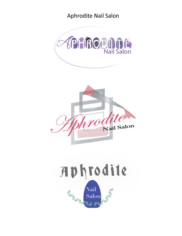
Top Logo – Font #1 Name & Category: Mad Beef (this has become one of my favorite decorative fonts)- Decorative
Top Logo – Font #2 Name & Category: Myraid Pro- Sans Serif (This one was very distorted)
Middle Logo – Font #1 Name & Category: Edwardian Script ITC- Decorative/Script
Middle Logo – Font #2 Name & Category: Big Carlson Medium- Slab Serif
Bottom Logo – Font #1 Name & Category: Deutsch Gothic- Decorative
Bottom Logo – Font #2 Name & Category: Didot – slab Serif
How the logo represents the company: This is for a nail salon the top design has the company name designed into the nail shape. The middle one is text being painted with nail polish. The bottom design has more of an ancient Greece kinda feel with a nail as part of the design
Votes on favorite logo:
Top Logo = __7_; Middle Logo = __2_; Bottom Logo = __2_;
My favorite logo was: The top one because I enjoyed placing detail in each nail, I felt that the design was really clever and I was told that it was different from any other design people have seen for nail salons.
Let me know what your favorite design is!
-The Designer- The Voyager, Marisa Faye Reeves-


