The Cure of Aging- Editorial Image

For my final assignment in my Vector Graphics class we were given an article and asked to create an editorial image for the article. The article is about a Harvard Professor who believes he can stop the aging process. You can read the article here; https://www.washingtonpost.com/news/achenblog/wp/2015/12/02/professor-george-church-says-he-can-reverse-the-aging-process/
Ideation:
After reading the article a few times, I made a list of things that came to mind. After I found a few words I liked I linked a few of the words that would go well together. I circled the words I liked and drew lines to the words I thought they would go well with.
Sketches:
After I found the words that I really liked, I started sketching out ideas. I did not want my design to appear so obvious, but rather I wanted it to make a statement and get people thinking. Here are the ideas I came up with:
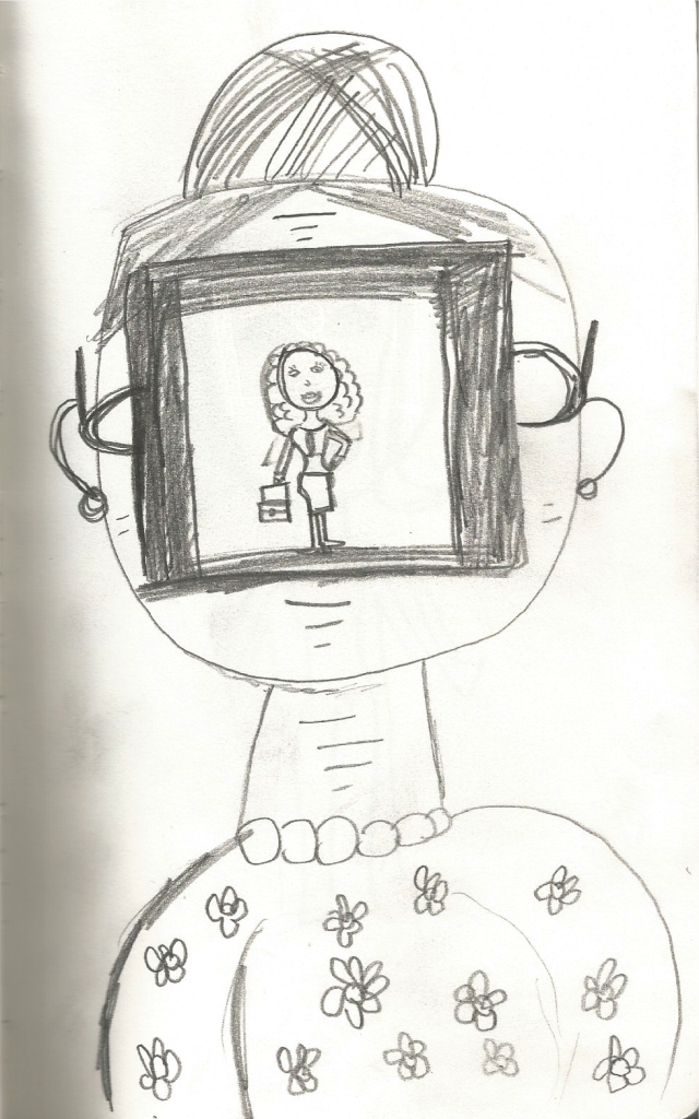
The first idea I came up with was an old lady with a polaroid picture of a young woman covering the majority of her face. I liked this idea because it showed a sense of wanting to go back to the good days when the old lady felt young and beautiful.
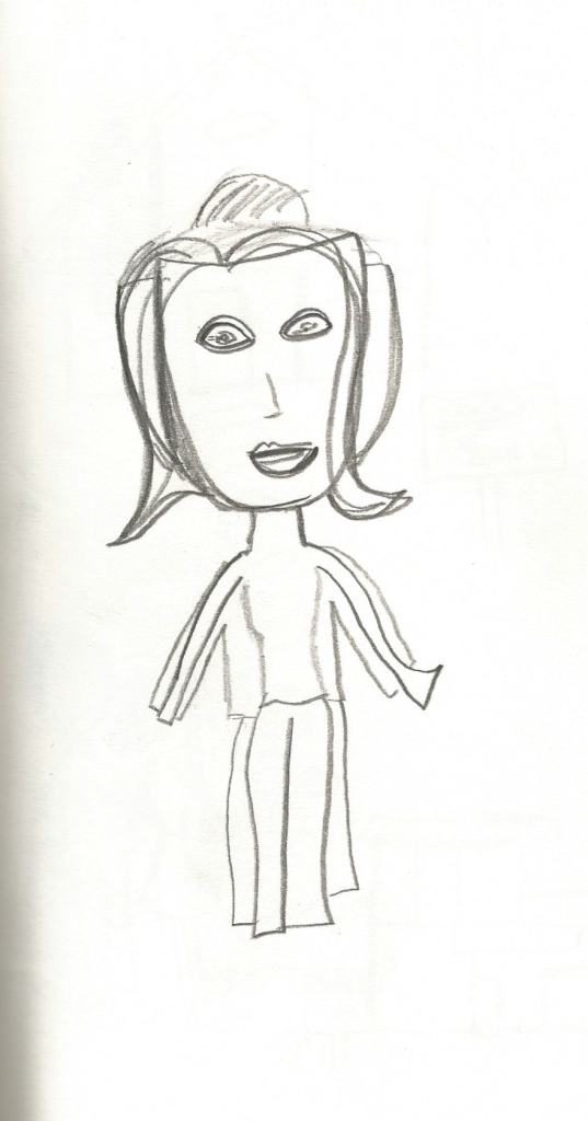
I well say that I really didn’t like how this sketch came out. This was supposed to be an old person masking their age with an actual mask and young clothes covering up their older frame. It didn’t quite execute the way I wanted it to.
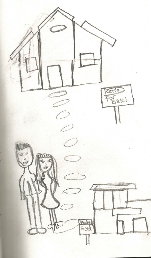
This idea shows Barbie and Ken walking away from their Retro Dream house and on to their new Modern Dream House. The design symbolizes new technology and leaving old things in the past. I really liked this idea but I thought it might be a little difficult and very time consuming to execute.
Draft:
I decided to go with the polaroid picture idea. The design turned out to be a lot more simplistic than I had in my mind, but I thought the dullness of the old lady and the vibrance of the young lady spoke very loudly.
The Final Product:
I honestly did not want to change a lot about my draft, changing a lot would change the whole concept and I liked the concept. I did make a few changes, I changed the old lady’s body shape as I thought the last one looked a little too young. I changed the format of the polaroid picture, some of the hair. I also had to clean up my layers a lot. I am not very good at organizing my layers so I spend quite a bit of time trying to make sure everything was in place.I tried fixing some tangent lines in my design.
I found this project very interesting and beneficial. I write a lot of articles for a local newspaper for my job. If I ever have the time to add an illustration this could be a great thing to add. I liked being able to openly interpret the article however I wanted to.
I feel like I have learned a lot in this class about Illustrator and hope that I will continue to learn more about Illustrator in my future endeavors.


