Project: Scooter
For the past two weeks in my vector graphics class we have been working on designing a two-wheeled vehicle. I chose to design a scooter. While looking for scooters to model my vector scooter after I discovered that most scooters actually do not look anything a like. I was going for more of a razor scooter look, however different parts of my scooter were modeled after different types of scooters.
Sketches:
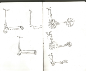
After researching which two-wheeled vehicle I wanted to create, and narrowing down bits and pieces of the scooter I began to sketch. I thought about going with a scooter with bike looking wheels, but since my sketches of that vehicle turned out like Dr. Seuss drawings I thought I should probably go with more of a typical Razor Scooter look.
Draft:
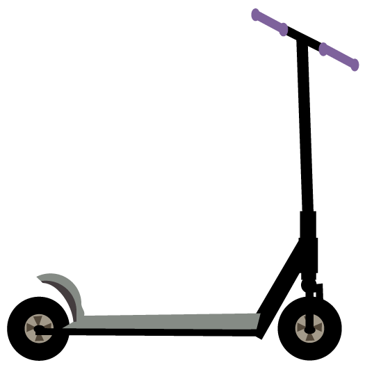
After making a decision on which features I wanted my scooter to have I took my design into illustrator. I designed a general idea of what I wanted my scooter to look like, I had not established a color scheme, filters or any other style choices at this point.
Final Scooter:
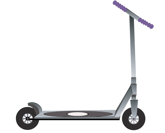
After I got a general idea of where things should go on the scooter, I went more in depth with these features. One item I struggled with were the wheels. Scooter wheels usually have a smoother texture to them than most vehicles do. The wheels are made up of this plastic-like material. They do not have wires in them like bicycles do. The center of the wheels have a metal fixture in them that connects to something on the vehicle.
It seemed that the wheels and handle bar areas are what gave me the most grief. It was difficult working with the front fixture that holds the wheel in place. Illustrator didn’t seem to want to allow part of the fixture to go behind the wheels. The handle bars I modeled my handle bars after had a foam-like texture to them so I tried adding a filter to make them look more foam like. I added the sponge filter, I am not really content with how they turned out but I couldn’t figure anything else out.
I went a little filter crazy on this project. I was not going for a photo-realistic look so I did not add gradients or a real metal effect. I did use a Bas Relief filter on most of the vehicle that would have metal on it. I also used film grain for that skateboard-ish look on the base of the scooter. I used a sketched filter on the tires to give it a more used look.
This project was both easier and harder than I would have thought. I did not find it as difficult as the watch project, but that may be because we did not have to make this project photo-realistic and I actually saved my Illustrator draft this time. The hardest parts were getting the wheels right and the perspective right. Overall I think the perspective looks pretty good but I didn’t really know what to do for the handle bars. I played with them for quite some time but nothing really looked right. I am learning to use shapes better, I don’t think I used a single stroke or line for this assignment. I do feel like I am learning a lot from this class and I look forward to these next few projects I will have coming up for the last part of the semester.
