A Brochure about ME!
For my Visual media class I was to design a brochure this is What I came up with:
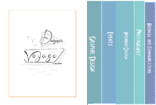
The Front View of My Brochure:
This Brochure has 5 different sections, each section has a page that overlaps the previous page just enough so you can see the titles of each section.
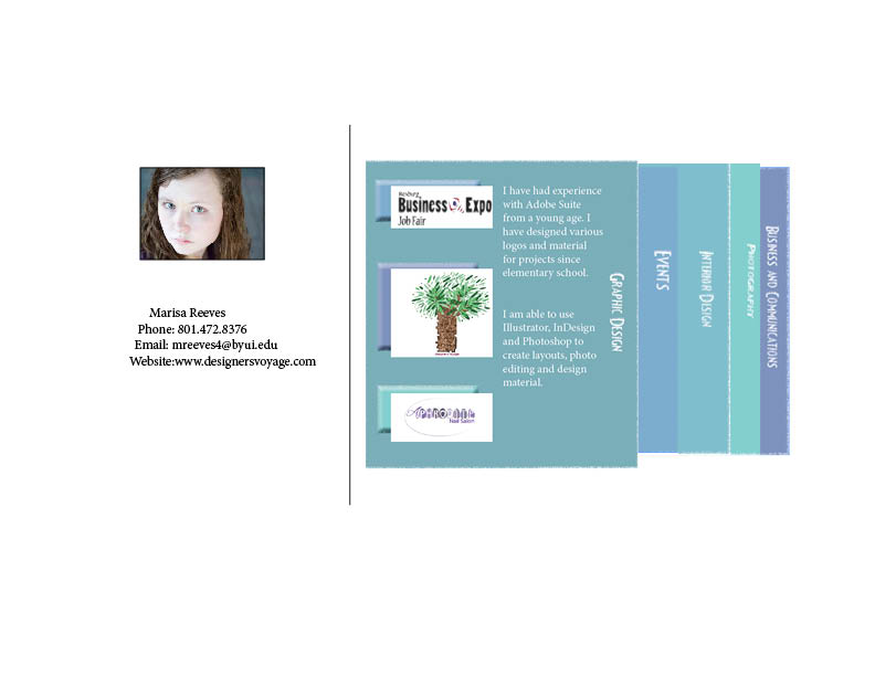
Here is what a section would look like:
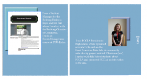
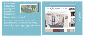
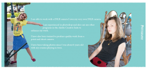
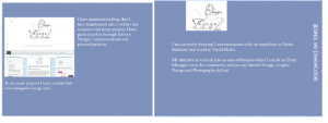
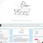
Here is are screenshots of what each category will look like:
This Brochure was created to showcase me 🙂
The Process of this was long, It was difficult for me to figure out how this would print out. I designed this primarily in Indesign, however I did some photo editing in Photoshop- of course. I gathered information, pictures and then designed the layout. I then placed my images and figured out where I wanted my text to display.
Three Things that I learned:
1. How to create this style of brochure, and think in a way that I would consider completely backwards.
2. How to create a more clean clipping in Photoshop
3. How to create a more sophisticated text wrap.
Word count: 348
Type used: Fancy Shadow (decoration) And Minion Pro (Slab Serif)
I have a lot of images (all of which are my own images) in this project but here are thumbnails for each of them:
I hope you enjoyed this post! Until next time,
-Marisa Faye Reeves








I absolutely loved you brochure. i think that it is unique and colorful! Great job!