Mariel’s Authentic Mermaid Tales
This project was inspired by two things:
1. My sister Mariel, who often we tell people who struggle with her name that It’s just like Ariel from the Little Mermaid with an M.
2. Growing up, my sister and I would pretend to be mermaids whenever we went swimming, as I’m sure most girls do at a young age (and maybe even now) I saw this maybe 3 years ago on Pinterest and I wanted my very own Mermaid tale:
http://www.pinterest.com/pin/188658671861088736/
I found out they were kinda pricey, and I looked up a tutorial on how to make them. One day I’d like to try it, but for now I’ll just create a fake company for them 😀
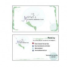
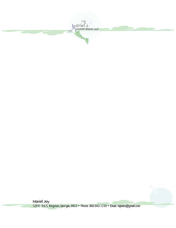
I began by designing a logo in Illustrator. I then took that logo into my Business Card Designs. I took the same logo into a stationary In-Design Document and copied elements found in Illustrator to In-Design to be able to create a repetitive unified company design. I formatted my Business Cards in In-Design to show size and how the two sides will come together.
Top 3 things learned:
1) So this week, my computer crashed. I’ve been sick (again) and was not in my right mind. My computer crashed several times and the first time I created a design that I really liked, with my unfocused mind I didn’t think to save it and then tried to create that same design, it didn’t work out so great. SAVE and BACKUP your work! If you are sick and can’t think, don’t be left a lone.
2) How to make Bubbles in Illustrator 😀
3) The importance in unifying a company by coping elements of design on each document
Programs/Tools Used: Illustrator, In-Design
Logo – Font #1 Name & Category: AusieBostinWonderland- Decorative
Logo – Font #2 Name & Category: Myraid Pro- Sans Serif
Stationery – Font #1 Name & Category: Abadi MT Condensed Light- Sans Serif
Stationery – Font #2 Name & Category: Fonts used in logo (no other fonts in this document)
How the logo represents the company:
Bubbles, appropriate name, Mermaid tale 🙂
I hope you enjoyed this fun project!
-The Designer, The Voyager, Marisa Faye Reeves-
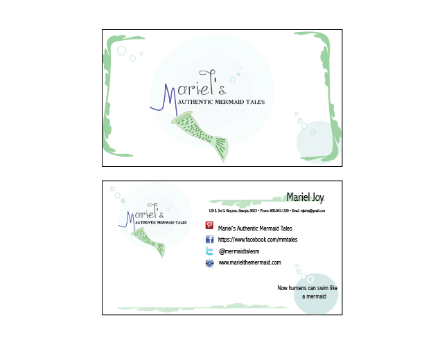
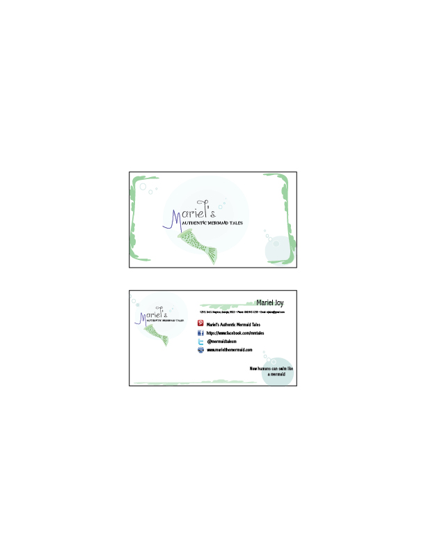


You did a really good job at creating a very engaging product. The images are well done and they are placed in a way that isn’t overbearing or that fights for too much attention. All your pieces are united throughout and the colors also go well together. I like how you have useful links to your online presence on the back of the business card too. You picked a really good font too, it’s not too decorative but it still have a airy, fun feel.