Super Montage
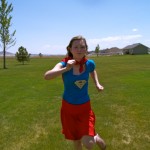
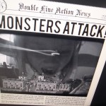
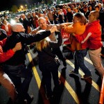
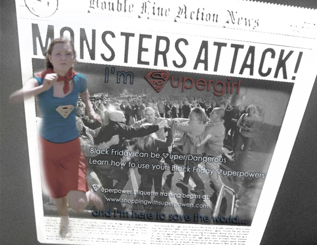 This project was designed for my visual Media class. I was to create a montage from 2 or more images (I have 3) and gradually blend them together to make a point. I sought inspiration from pictures on my own computer. I was able to find a picture of me when I was Super-girl for my little sisters birthday party and a picture another one of my little sisters took of their video game (The Monster Attack Newspaper). I got the idea to use Black Friday as my subject and Super girl as my theme encouraging shoppers to stay “Super” safe during their Black Friday adventures. Techniques I used included, Using Mask Layers, blending techniques, layer and text drop shadows and other effects.
- Top 3 things learned:
1) I have not used Masks in about 2 years, I used them while I was in the Interior Design program but I do not remember using them like this. I didn’t use masks to blend but rather to add furniture to a perspective drawing. It was a challenge for me to blend and blend neatly.
2) How to creatively align text- it was difficult to align with the newspaper but I recognized the importance of the text being aligned well with the newspaper. It took a lot of time to accept the way my text was aligned in this project.
3) Black and white can be useful in eliminating competing elements as well as lightening supplementary elements. At first I was trying to use a colored image inside the newspaper, it just wasn’t working. The light black and white worked much better to make Super-girl stand out more.
Programs/Tools Used:
Font #1 Name & Category: Century Gothic- Sans Serif
Font #2 Name & Category: Paul’s SUPER font
Filters I used: Film Grain and Poster Edges
Tools: Photoshop, Internet (http://politicsdownanddirty.blogspot.com/2012_11_23_archive.html) , Iphoto, Nikon Point s3100
3rd Image found at: http://politicsdownanddirty.blogspot.com/2012_11_23_archive.html
-Marisa Faye Reeves, The Designer the Voyager-
