Cheese Louise Event Flyer

Description:
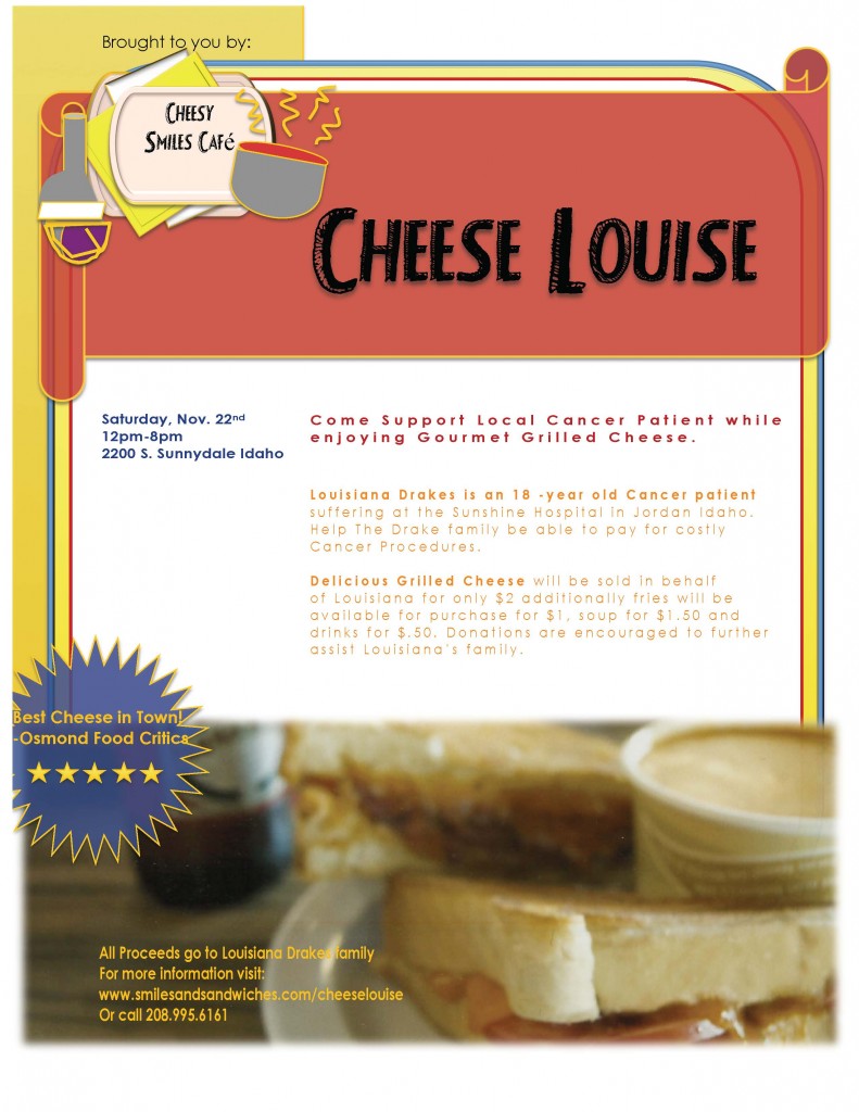
I designed this flyer for my Visual Media class, This was a challenge for me because I have always had Adobe programs around me since my mother is a graphic designer and I pursued a life of design as well. I was NOT allowed to use Adobe programs on this specific project, I quite honestly did not know how to use word to design anything, I never needed too. There were times where I really wanted to open up illustrator, InDesign and Photoshop but I was able to compose this project entirely from MicroSoft Word as I was assigned to do, even the logo which was a struggle but a push for me. The assignment was to create a flyer for a beneficiary and a benefactor using a high quality image that we were to scan. The content was entirely made up by my insane mind (It really is more crazy than normal this week because I’ve been sick). My friend asked me if I was given the content, I think I’ll just take that as a compliment to my creativity and writing abilities and not question my sanity 😀
Process:
I began with an idea of grilled cheese…..I guess that’s what makes me happy when I’m sick? Honestly I don’t know where the idea came from but it came. I used a picture that I took at a place called “Meltaway” one of the very first pictures I took with my Nikon D3100.
I sent that picture to be printed at Walgreens then I scanned the image into my computer through my own personal scanner that seemed to have advanced enough options to perform the correct scanning procedure we had learned in class.
After using the options on my scanner, I opened up PhotoShop from my computer to make sure the formatting of my image was correct- I didn’t have to do much tweaking as far as formatting went, I had a well formatted image to begin with.
Next, I began my draft. I placed my image in MicroSoft word and proceeded to play with layout, color and text.
After my first draft I realized I left off some pretty critical information so I went back and added those important details, took out text, re-aligned my text and designed a logo through Word- as I said before that was a challenge. My main concern was that I probably was going to have competing elements, I’m sure I’ll get comments about that, however looking at the image for a long period of time I grew more certain of my choice and my roommates didn’t seem to think anything really competed.
Top 3 things learned:
1) Sometimes we are limited to programs- I have never had this issue so it never occurred to me that I may be without a program that I feel more comfortable in. I feel it is important to have a wide variety of skill in various programs, I have been taught how to use programs that my peers would have never touched at a very young age (8 to be exact.)
2) Sometimes it’s okay to design in Word, my mom always seemed to have given me a negative connotation of Word, maybe because we tend to over think things and also because Adobe gives you so much more leeway, Word limits you but sometimes you have to learn to work around your limitations.
3) I learned a lot more about formatting- you would think this would be a topic that has been pounded in my head, but honestly this is the first time I remember being taught about how to correctly format a picture so it does not appear pixelated. Even when I was in the Interior Design program, if our scans were not good enough you kept scanning until you got it right, if you found a low quality image you had to completely disregard it and search forever to find something that would still fit your concept. This formatting is so much easier than wasting hours trying to get your perfect image!
Program(s) / Tools used:
Hewlett Packard Scanning Software/HP Scanner, Adobe Photoshop (For formatting only) Microsoft Word
Font for Title:
Fancy Shadow, Decorative
Font for Body:
Century Gothic, San Serif
Sources:
Image taken from my Nikon D3100, 4×6 Print scanned in through Hewlett Packard Scanning Software, reformatted in Photoshop to 1200×800 Pixels (Approx. 8×5)
 All Information was created through my imagination, none of the information on this flyer should be used. The Website listed is a fake website, I checked it (I highly advise checking false information to protect yourself and your dignity) The phone number is more than likely a false number- I did use an Idaho area code to give it a more believable appearance. Louisiana Drakes does not represent a real person nor is this a real cafe.
I hope you enjoyed this project and will be with me for many more!
-The Designer, The Voyager, Marisa Faye Reeves-


