Graduate Leadership Flyer
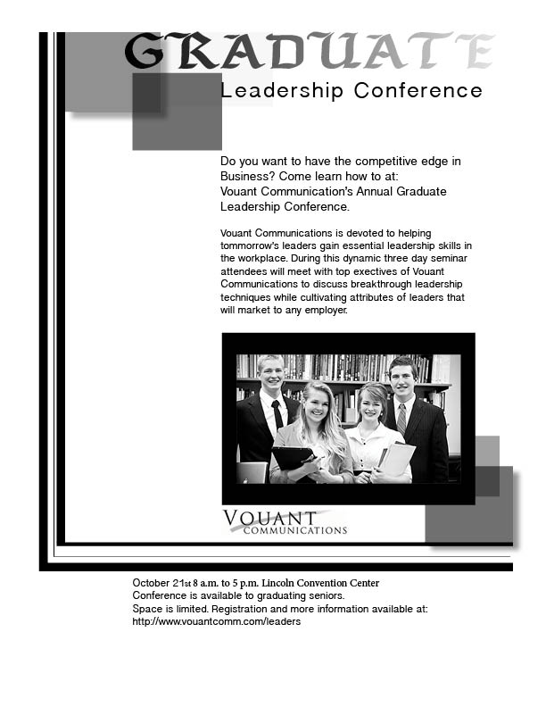
Description: This is a flyer that I designed for my Visual Media class this week. I was given the information, picture, logo and was assigned to design the layout. The layout had to fit in with the P-A-R-C-F principles (Proximity Alignment Repetition Contrast and Flow) to create a visually appealing image to the target audience.
Process: I started by sketching 4 possible layouts with a fine pen. I then opened up In-Design and began to play with variations of my sketches. I started to play with alignment and repetition. Once I was pretty much set on my layout I began to search for fonts that would be appropriate and visually appealing. I had trouble finding a title font that I felt pleased with for this particular design so I searched on dafont.com for a more exciting font, I played with my options for quite a while. Once I found a set font style I had to rearrange my alignment and adjust my kerning. Then I used simple effects such as applying drop shadows and feathers.
Top 3 things learned:
1) I don’t think I center very much of my work, I’m pretty artistic, however I do not believe I realized how much more visually appealing text looks when it is not centered.
2) Try various kinds of Fonts, you may be surprised and rather pleased with your outcome. It’s easy to be set on one particular style or use the fonts that came with your program but it’s more exciting to try something new.
3) If there is one word that is floating on it’s own line that’s known as a “Widow” and it should not be left a widow. This takes some extra thinking when a word does not fit on the same line as the rest of your text but it’s important to keep that little word with the rest of it’s family.
Program(s) / Tools used: Adobe In-Design, dafont.com, Visual Media course instructions and content
Title Font Name & Category: Seagram tfb- Decorative
Copy Font Name & Category: Khmer Sangam MN- San Serif
Links to all images you used in this project: https://byui.brainhoney.com/Frame/Component/CoursePlayer?enrollmentid=14850383&itemid=W6ZJH
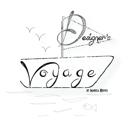
-The Designer, The Voyager, Marisa Faye Reeves-

Related Posts
-
 Senior Showcase Advertisements
Posted on Apr 14, 2014
-
Photo-book take 2
Posted on Mar 13, 2014
-
 Photo Book Take 1
Posted on Mar 6, 2014
-
 A Brochure about ME!
Posted on Dec 7, 2013
Tags
Share This


I think the use of squares, gradience, and translucence is very unique and makes the flier more appealing and artistic. Great amount of white space too, and alignment.
There is perfect flow across the page. The image you chose also ads to the flow because the direction they are looking.
The only thing i didn’t like was the font used for the header, I would’ve used a slab serif.
Hi Marissa,
I can see that you experimented with fonts and artistic layout such as framing, contrast and fading, which contributes to the artistic appeal of your flier; however, it detracted from the information, which was a little hard to find, which detracted from my interest of really finding out what the flier was about as I was busy trying to make connections between the different fonts and layout. That being said, I really like your personal logo.
Wow! What a great flier! I love the faded boxes and the border around the 2 sides of the page, I think it really helps with the flow and allows the viewer’s eyes to stay on the page. The alignment is very visually appealing and the contrast between the 2 fonts looks great!