Color + Texture
For Color Theory class we had an assignment to play with color and texture then display them in an aesthetically pleasing way. We were to create 3 different boards each of which with a different color Scheme here is what I came up with:
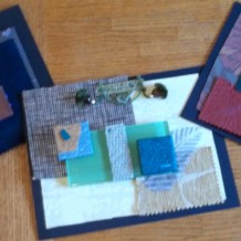
 This first board I think of a very Chic yet jungle look. A lot of the materials I used for this board I feel would be adorable in a nursery. I used 2 different pieces of wallpaper with unique texture patterns to them, tile samples, a glass sample, cork, wood, fabric, rubber and trim. My color scheme for this board is Analogous- colors next to each other on the color wheel I used 3 colors as my main Hues, Blue, Green and Yellow.
 For my Next color scheme I did a split complement- a hue and the colors beside it’s complement. I chose to use Purples, Greens and Oranges for this color scheme. This is a very warm color Scheme. I used Wallpaper, fabric, and leathers to compliment these colors according to their textures.
 My Last board I used Cool colors with Warm Value. This one was really fun my roommate and I went out in our apartment parking lot and started throwing a block of granite against the gravel in order to break the granite and add the granite to my board. We also broke glass (carefully- don’t try it at home folks). This board I used the widest variety of materials in the display. I used Rubber, Granite, Glass, Metal, trim, fabric and leather.
Which Board or Color Scheme is your favorite and why? I am very curious as to impressions that are felt towards these boards and what you would call each board and why. Please share.
Marisa Faye Reeves


Related Posts
-
 1920s, Art, Design and Life
Posted on Aug 24, 2013
-
 Home Show
Posted on Apr 17, 2013
-
 March Madness Trend Bracket
Posted on Mar 25, 2013
-
 Youthful Azure Parlour-Rendered Living room cottage
Posted on Apr 5, 2012
Tags
Share This


